Unlock the Power of Data.
Empowering Decision-Making with Visual Intelligence.
Transform your data into impactful visualizations during the data exploration and visualization phase of your Business Intelligence (BI) process. By simplifying data analysis and leveraging interactive dashboards, you can easily share your workspaces with colleagues, facilitating collaborative decision-making and aligning your business strategies with data-driven intelligence.


Databases
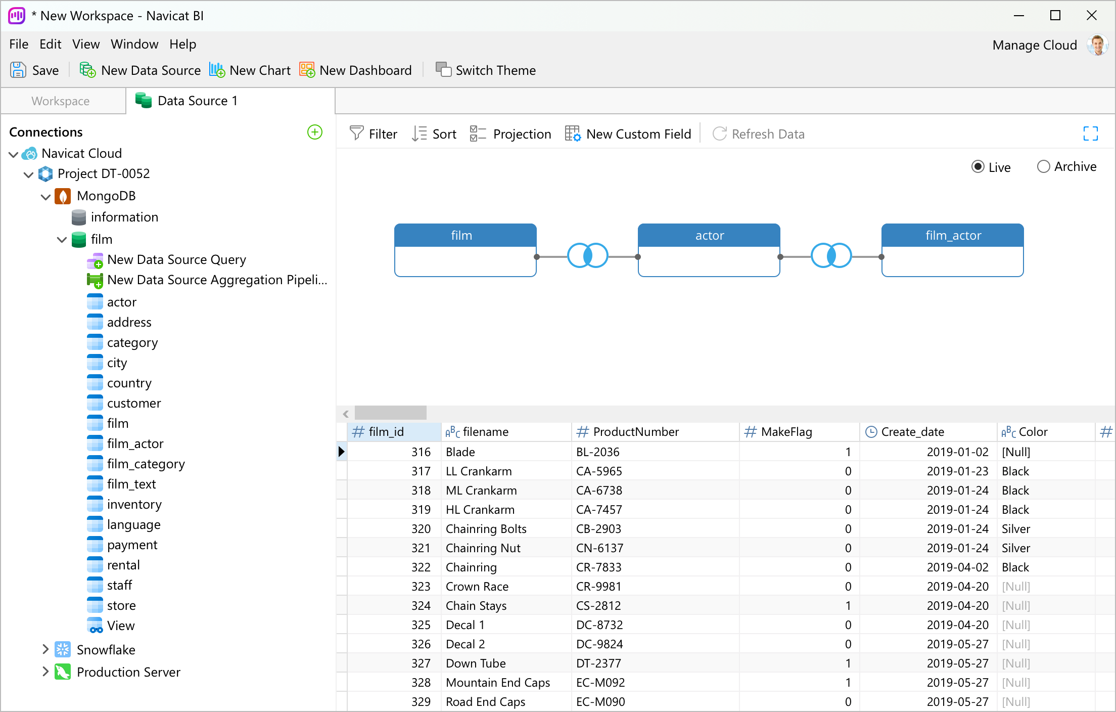
Connect to a number of different databases: MySQL, PostgreSQL, SQL Server, Oracle, SQLite, MariaDB, MongoDB and Snowflake.

ODBC
Import data from any ODBC data sources including Sybase and DB2.

File Types
Import data from external files such as Excel, Access, CSV, from data stored on your computer, network, or a URL.

Linked File
Link your chart to data in data sources to update the chart according to changes in the underlying data.
Custom Fields
Extend your data with customized fields. You can capture data not available in the standard fields to better suit your unique requirements.
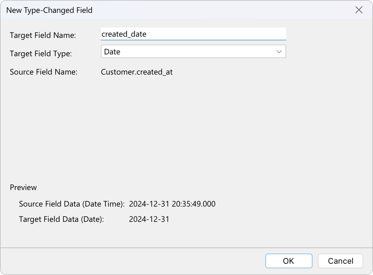
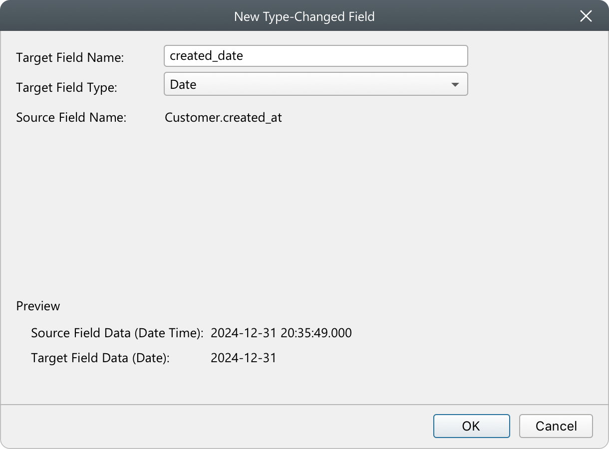
Convert the data type of a field to ensure accurate representation and appropriate analysis in a chart.
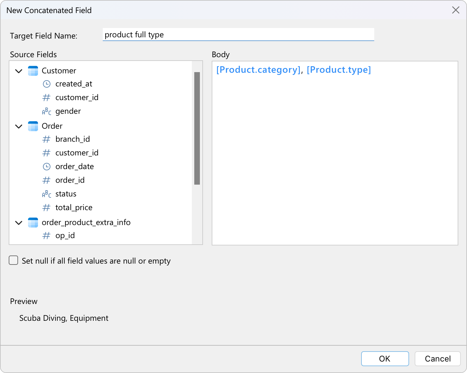
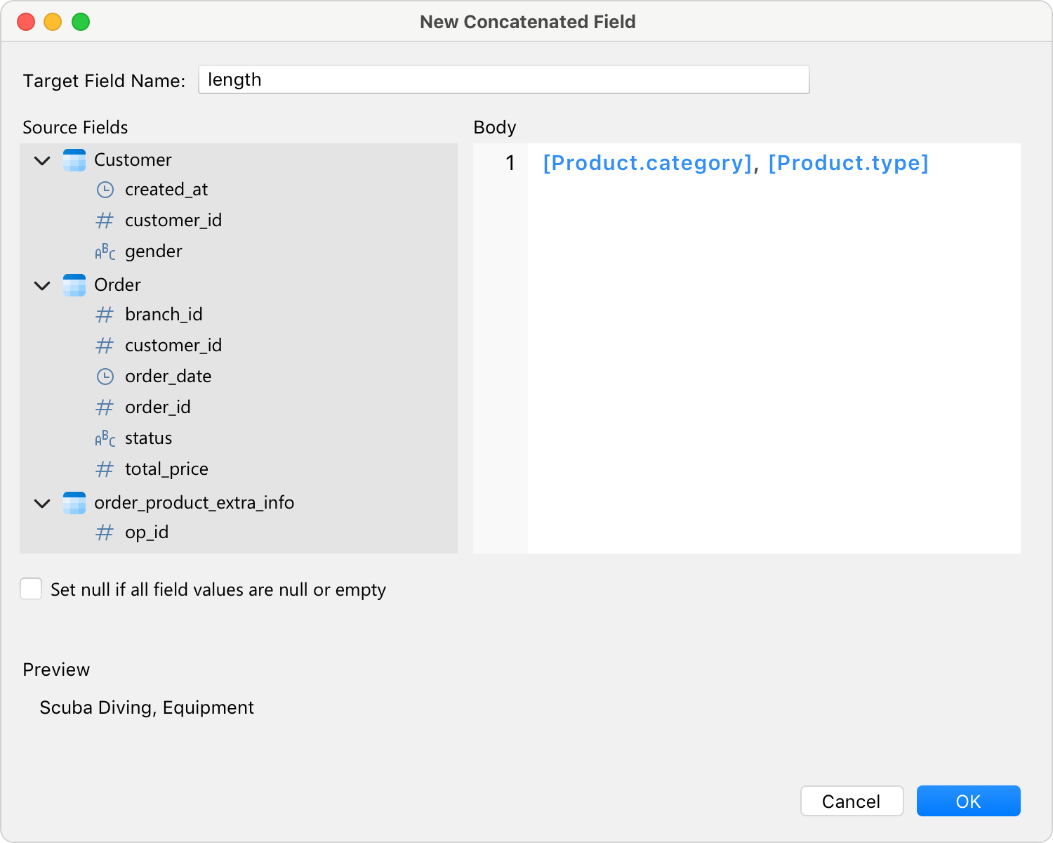
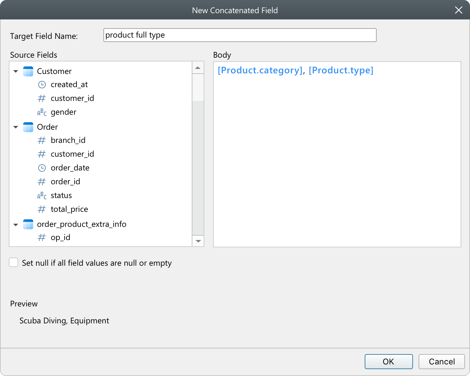
Merge the contents of different fields together to create a new field that can be used in your charts.
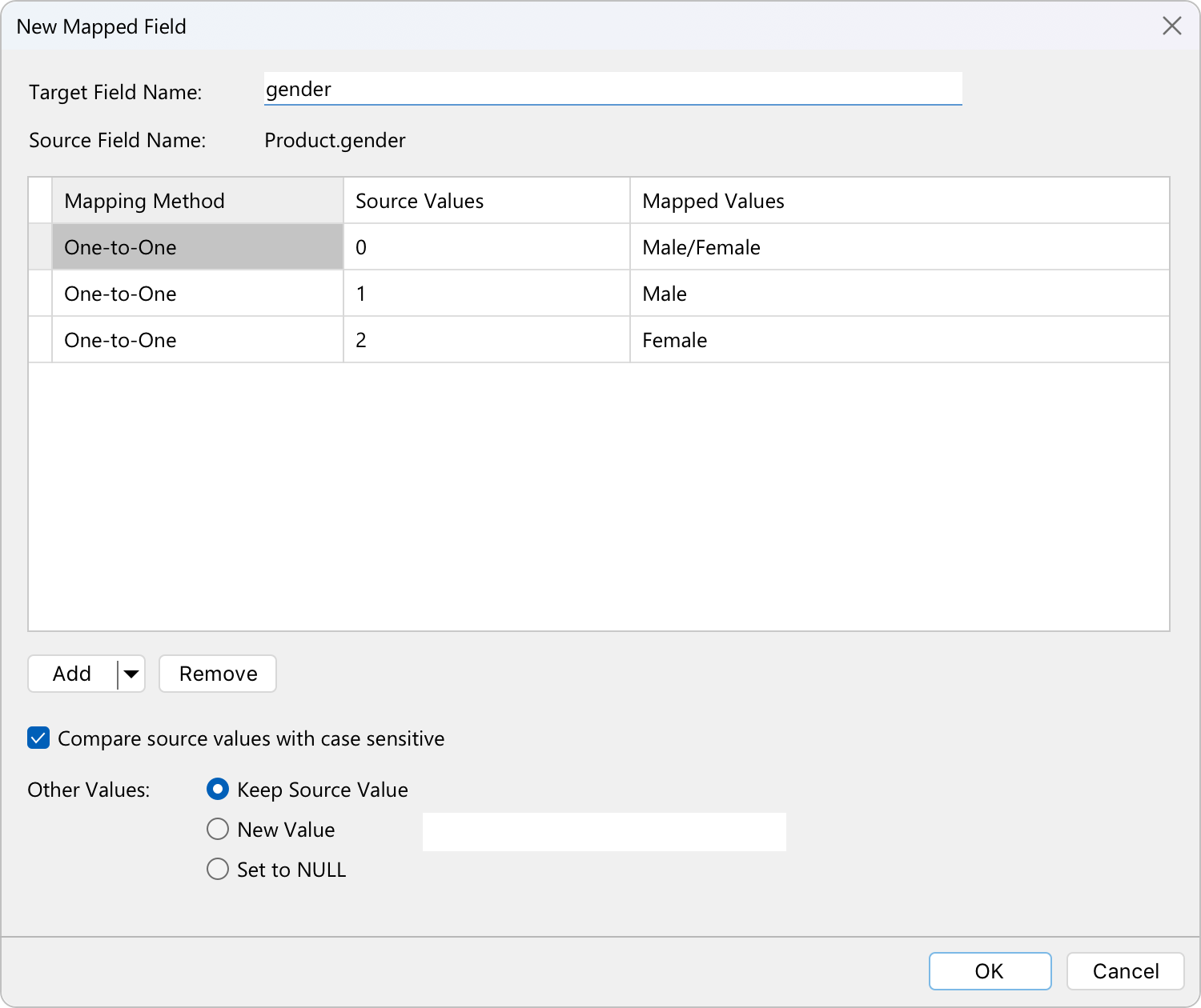
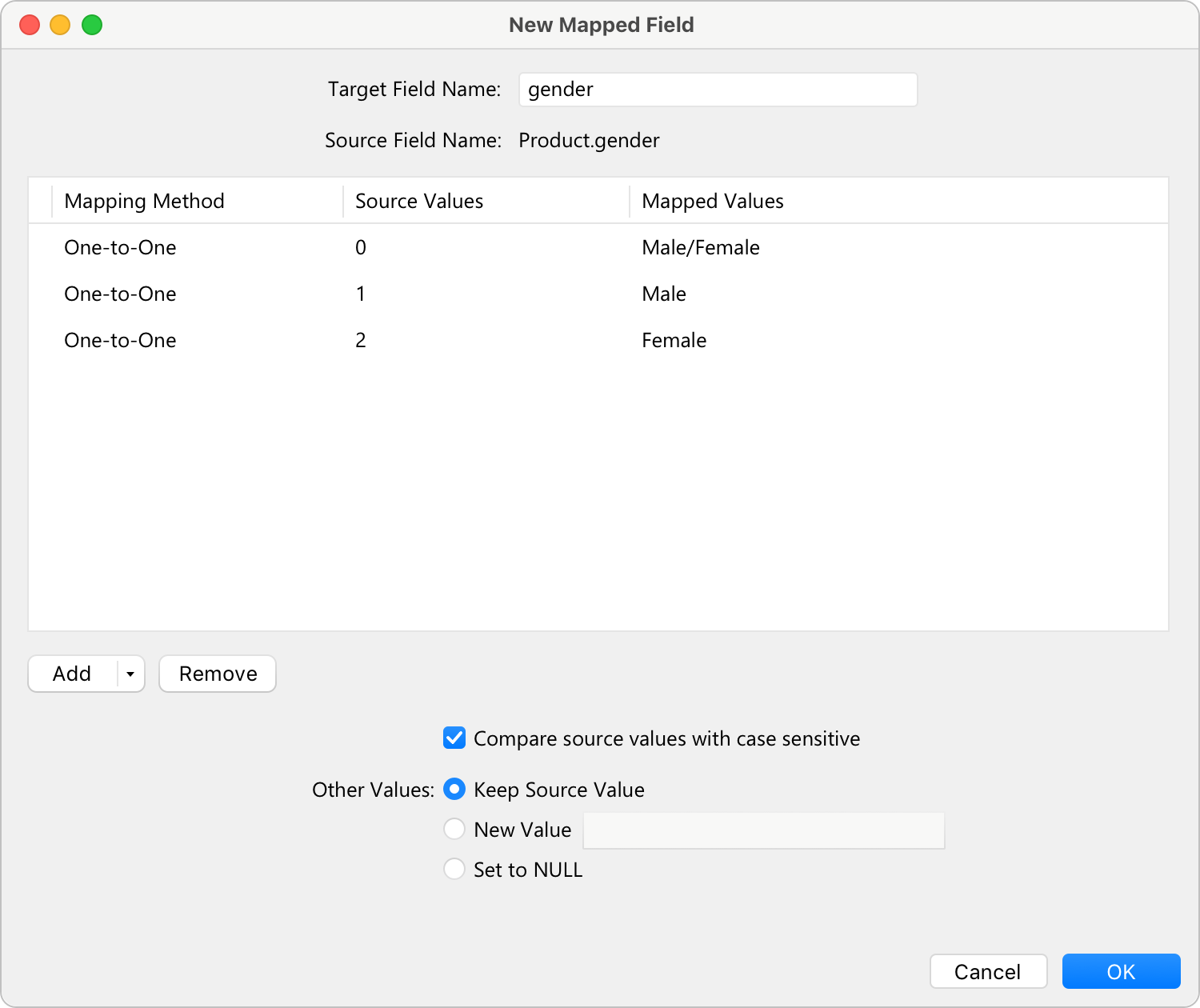
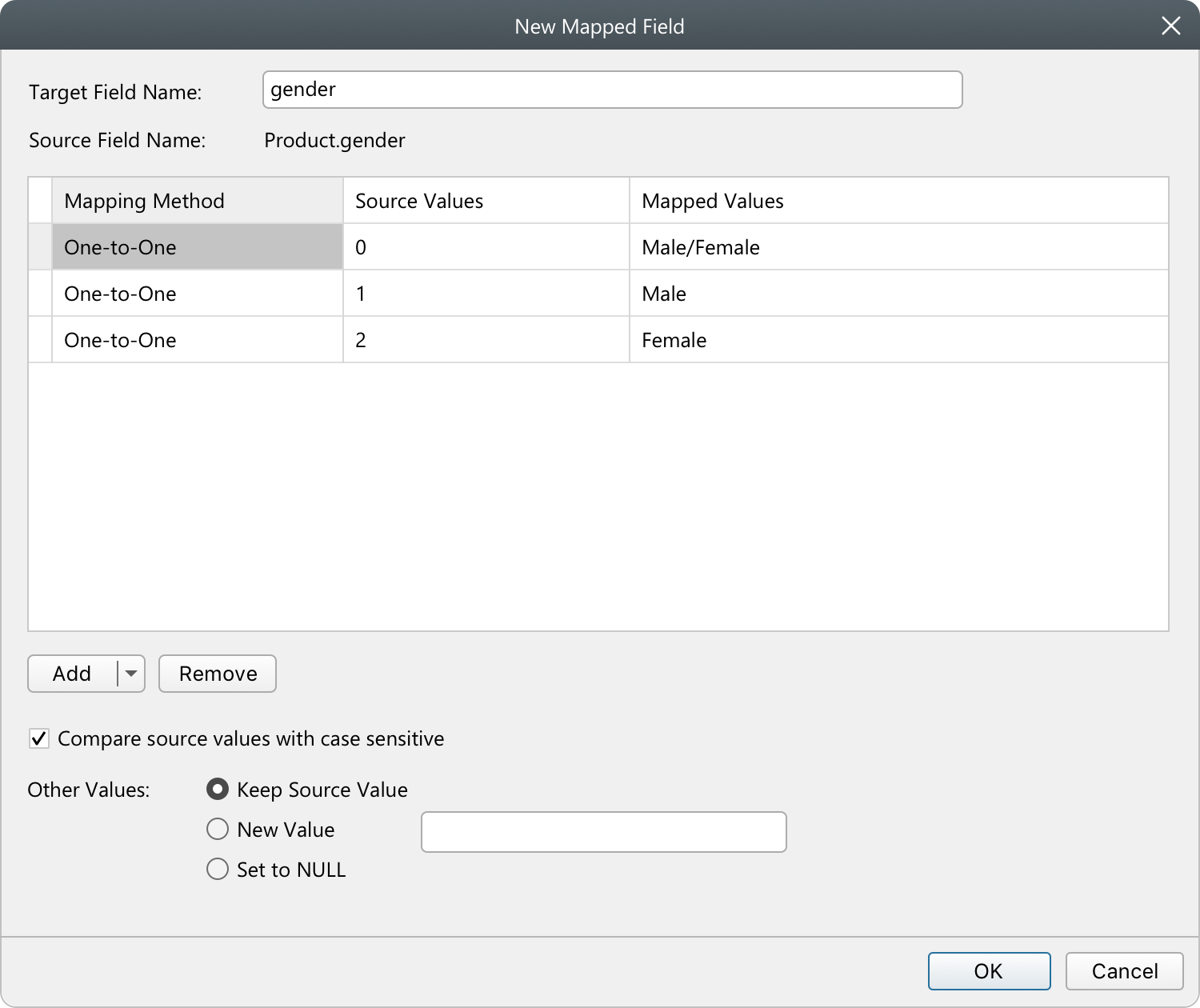
Create a new field populated with the results of applying a mapping rule on every value in the source field.
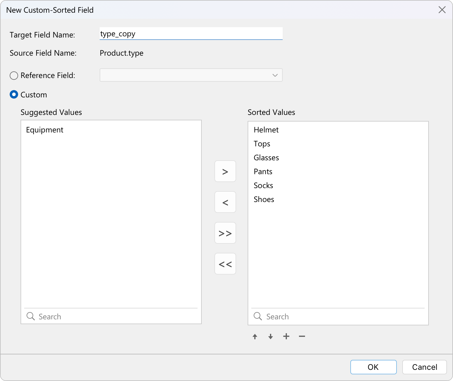
Rearrange the order of the values based on another field or a custom order. When you sort this new field in the chart, it will be sorted in the order you set.
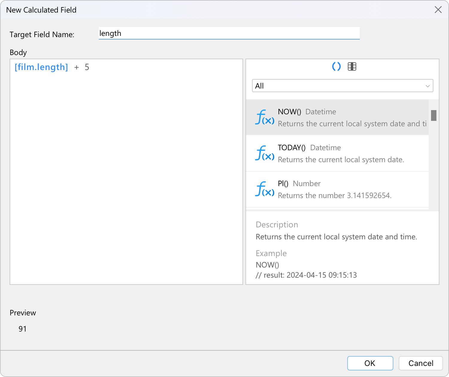
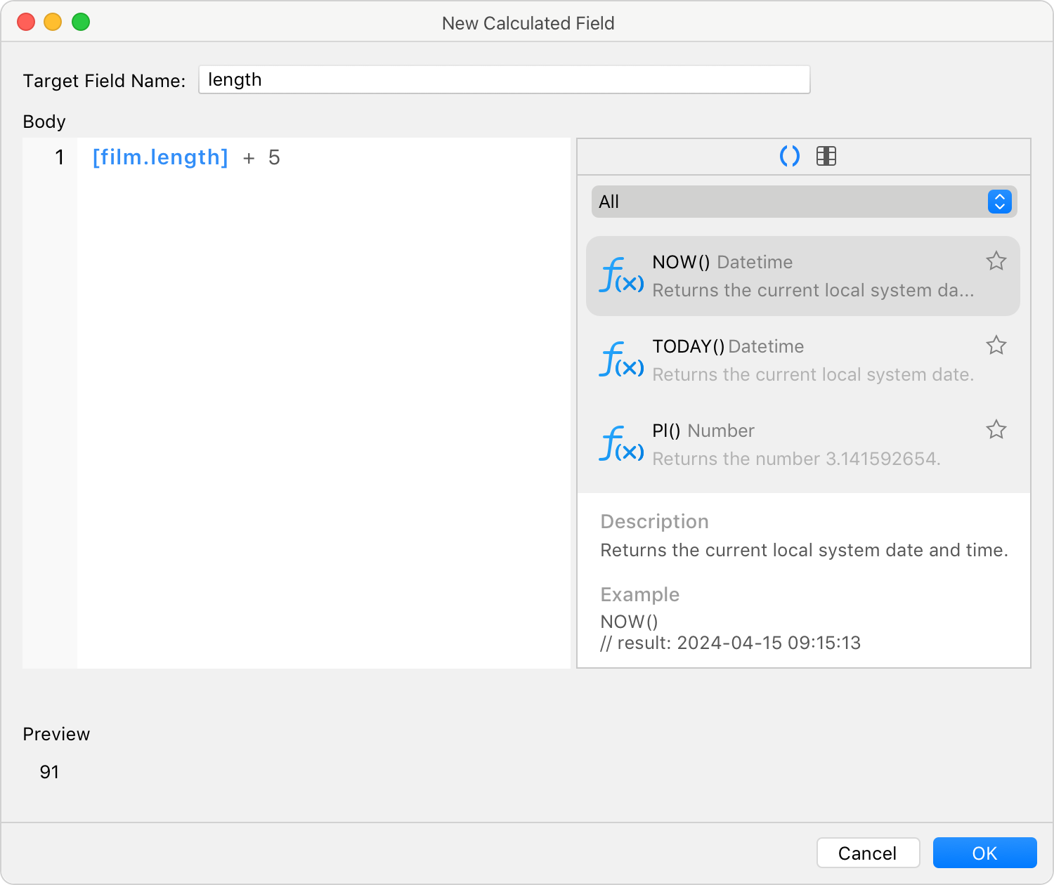
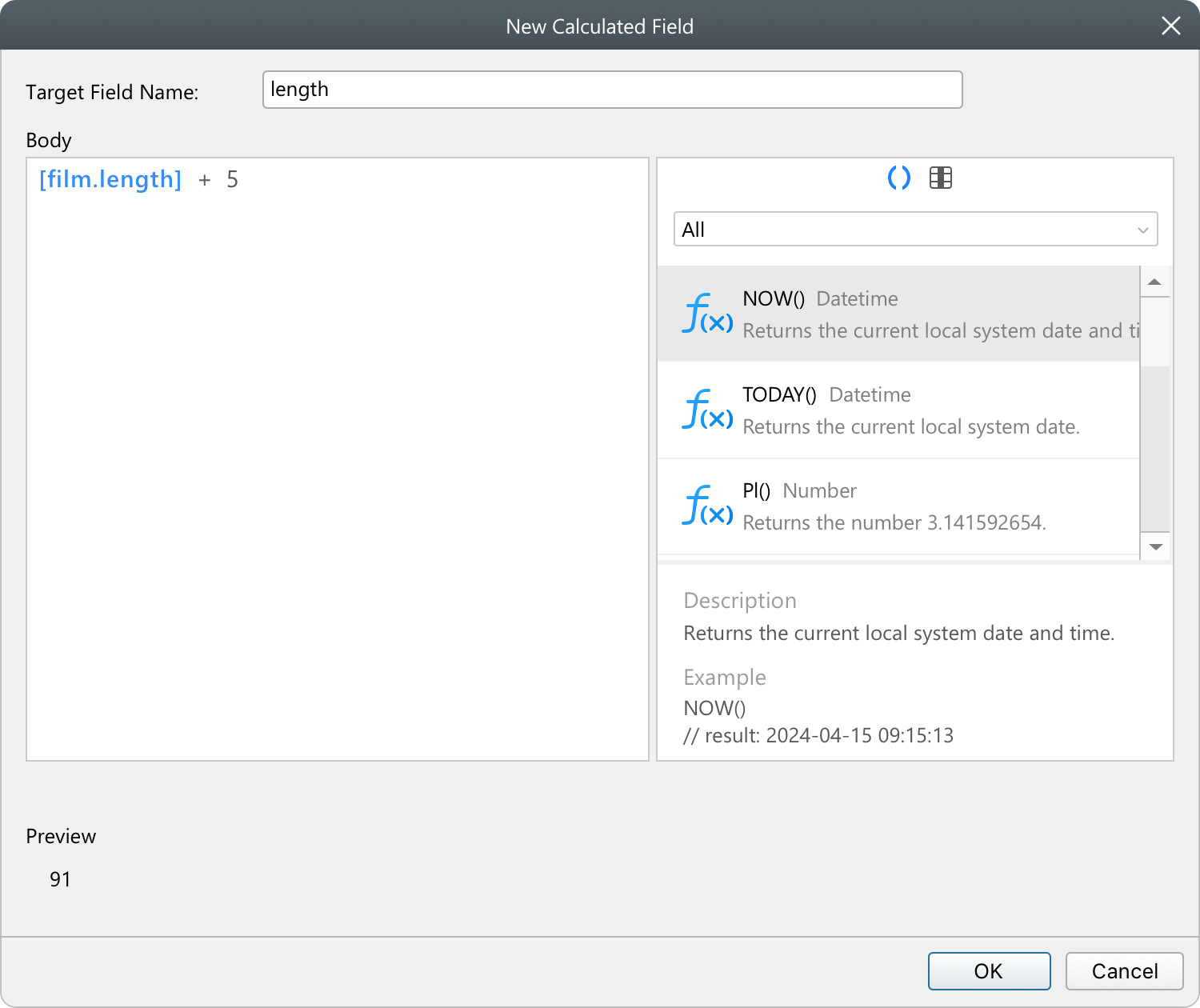
Apply combination of functions, fields and operators within the custom expression to perform advanced calculations without the burden of manual data manipulation.
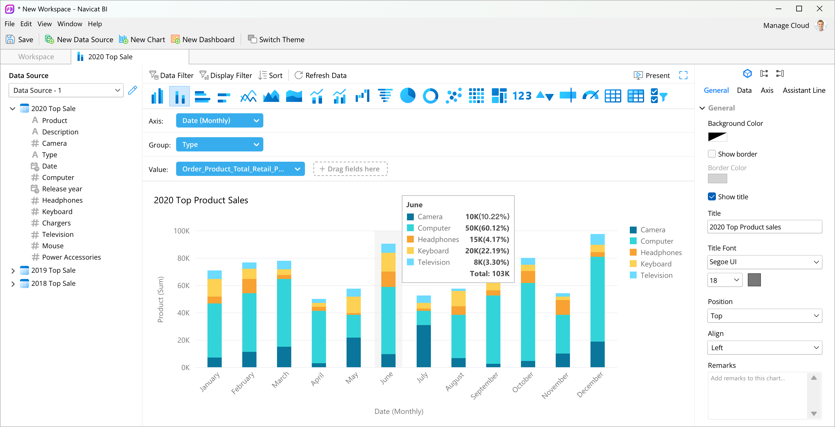
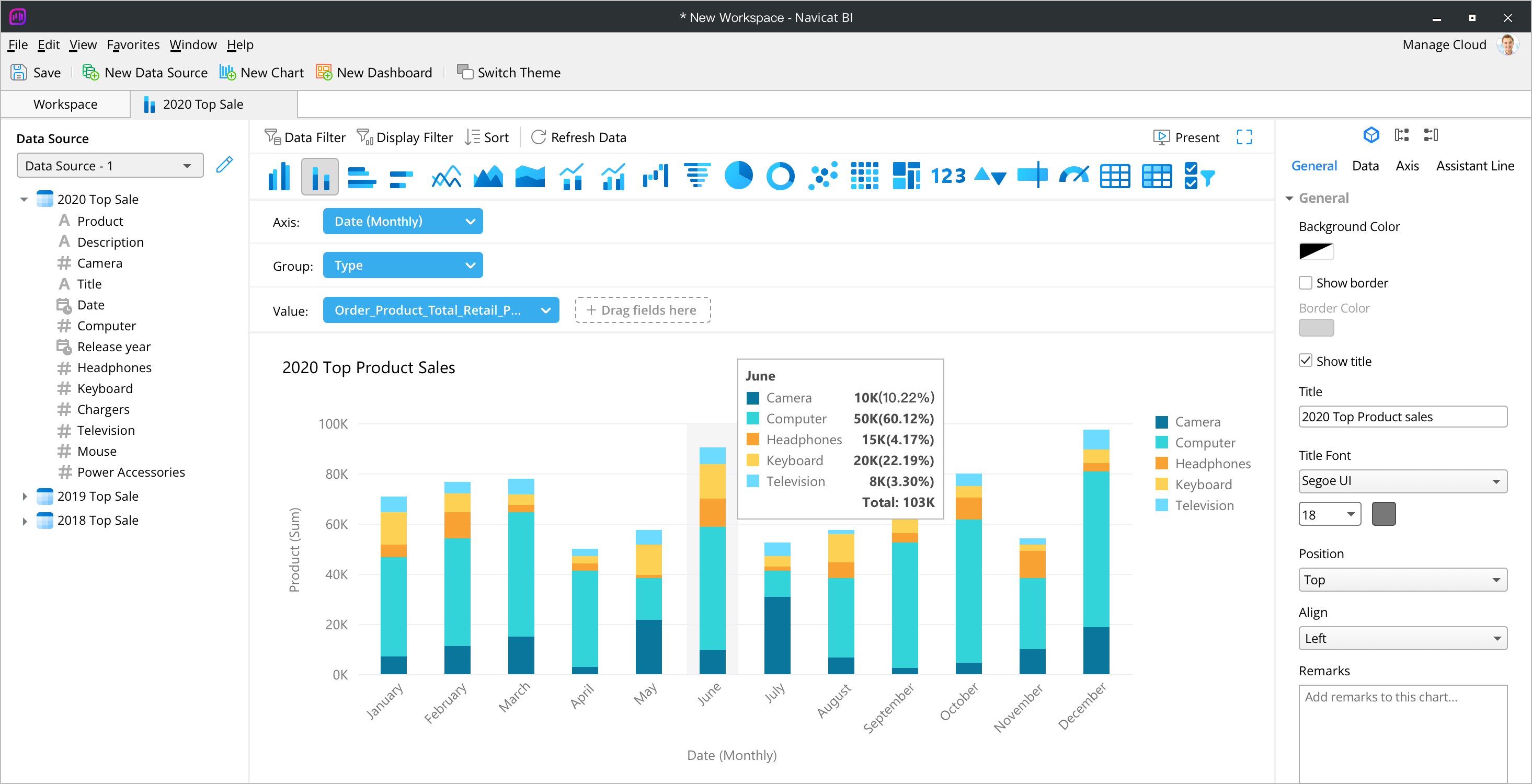
Visualize your business data with diverse chart types.
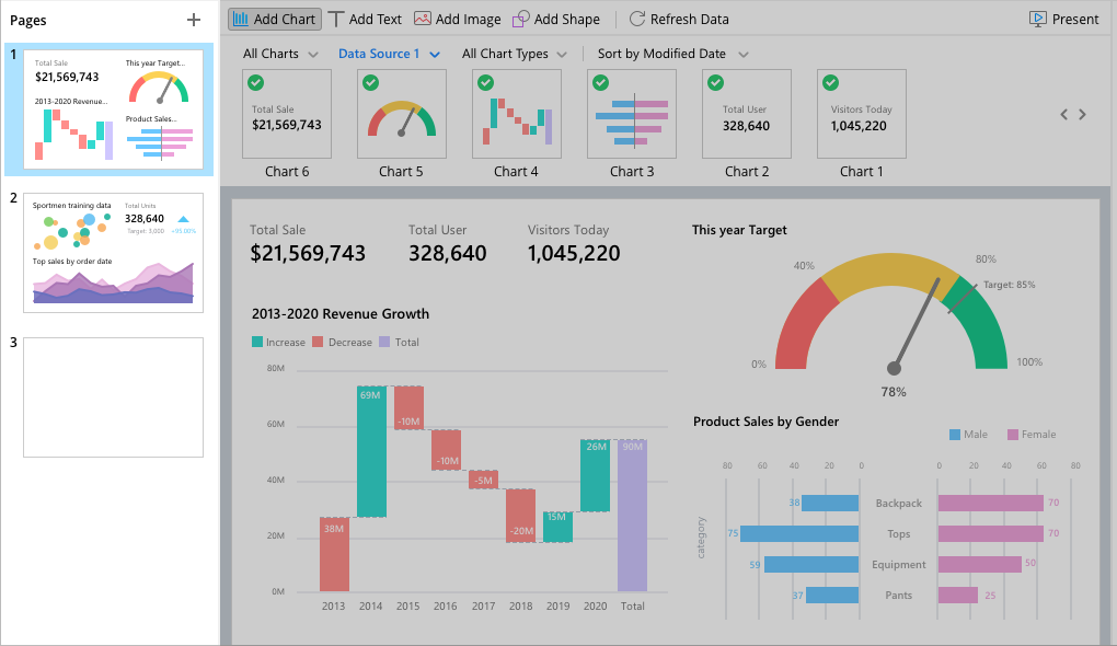
Illustrate your data in a meaningful way. Choose the appropriate chart type to ensure your questions are answered and your presentation conveys the message you want to communicate.


Give a good idea of the direction of the trend.
Add a trend line to your chart to visualize the general trend in your data. Choose the type of trend line you want and format the trend line to make it even more understandable and easily interpreted.

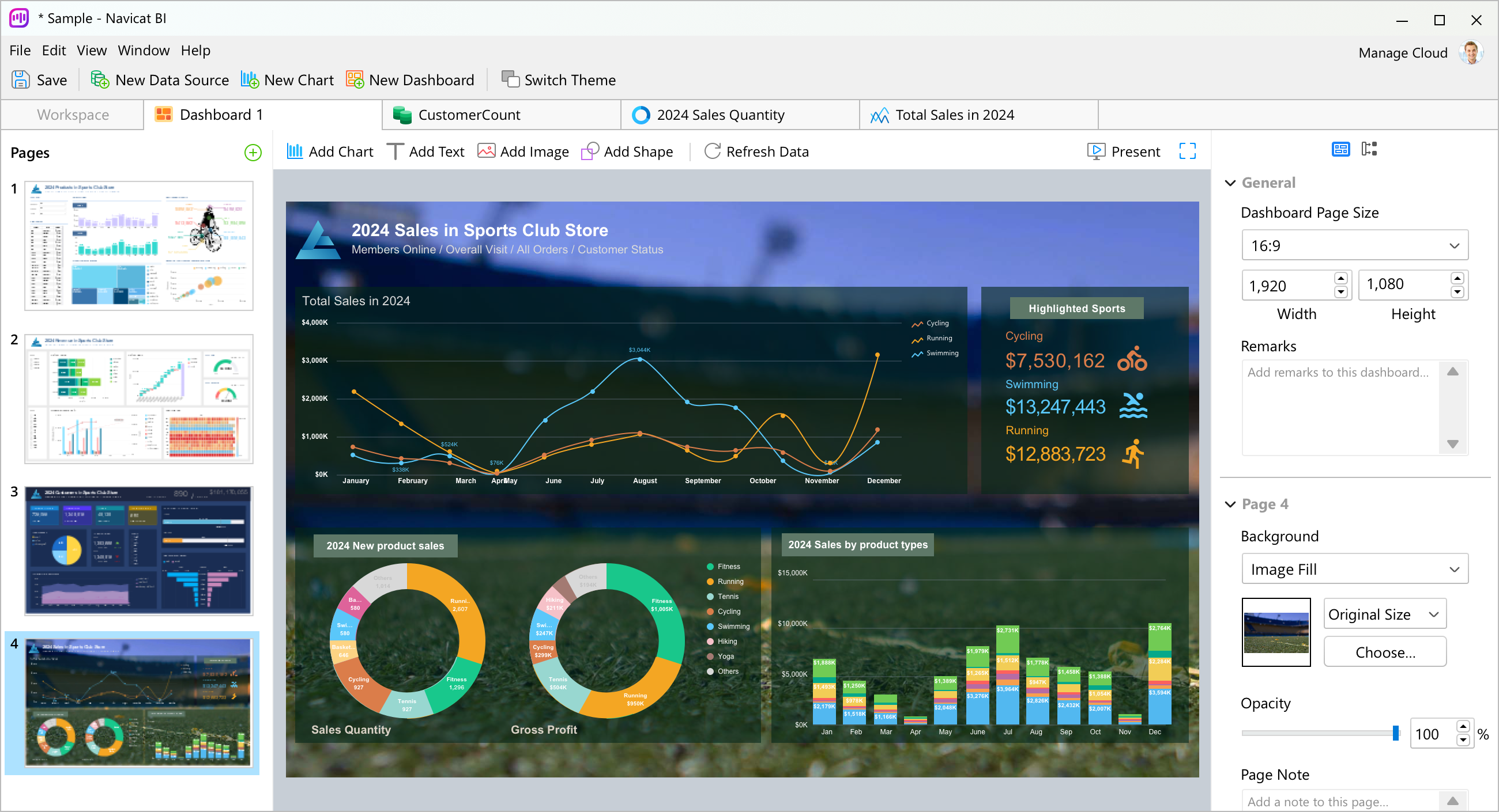
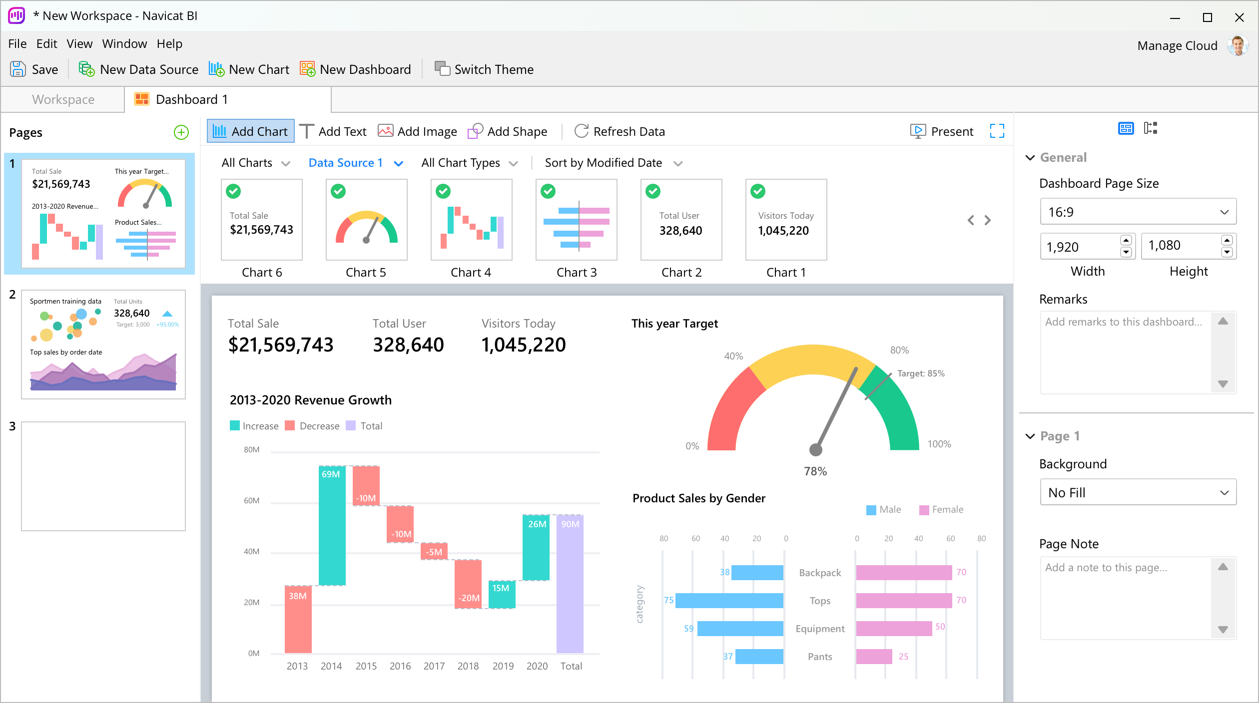
Create effective dashboards.
Design more powerful dashboards to uncover fresh insights that would otherwise go unnoticed.
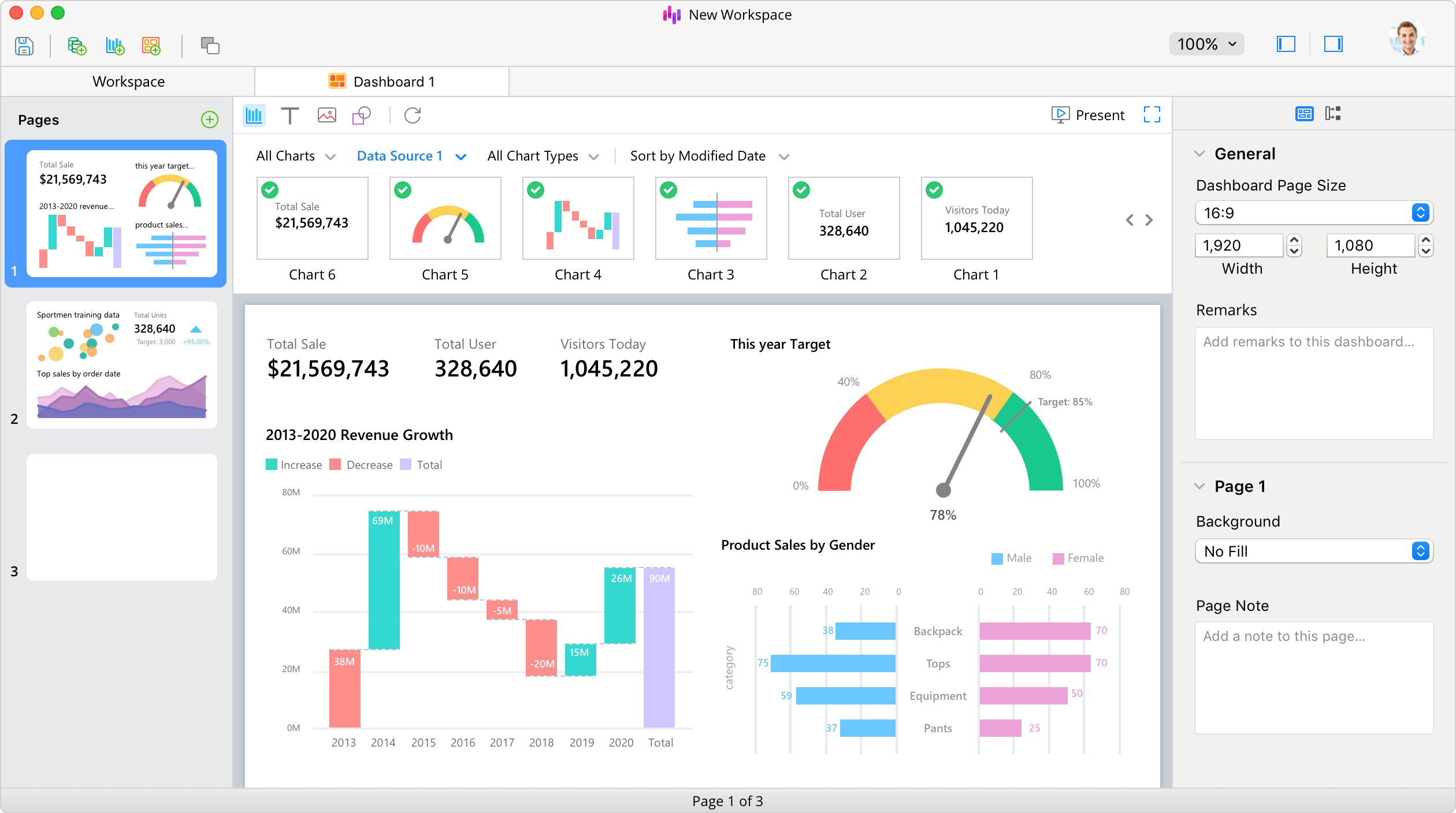
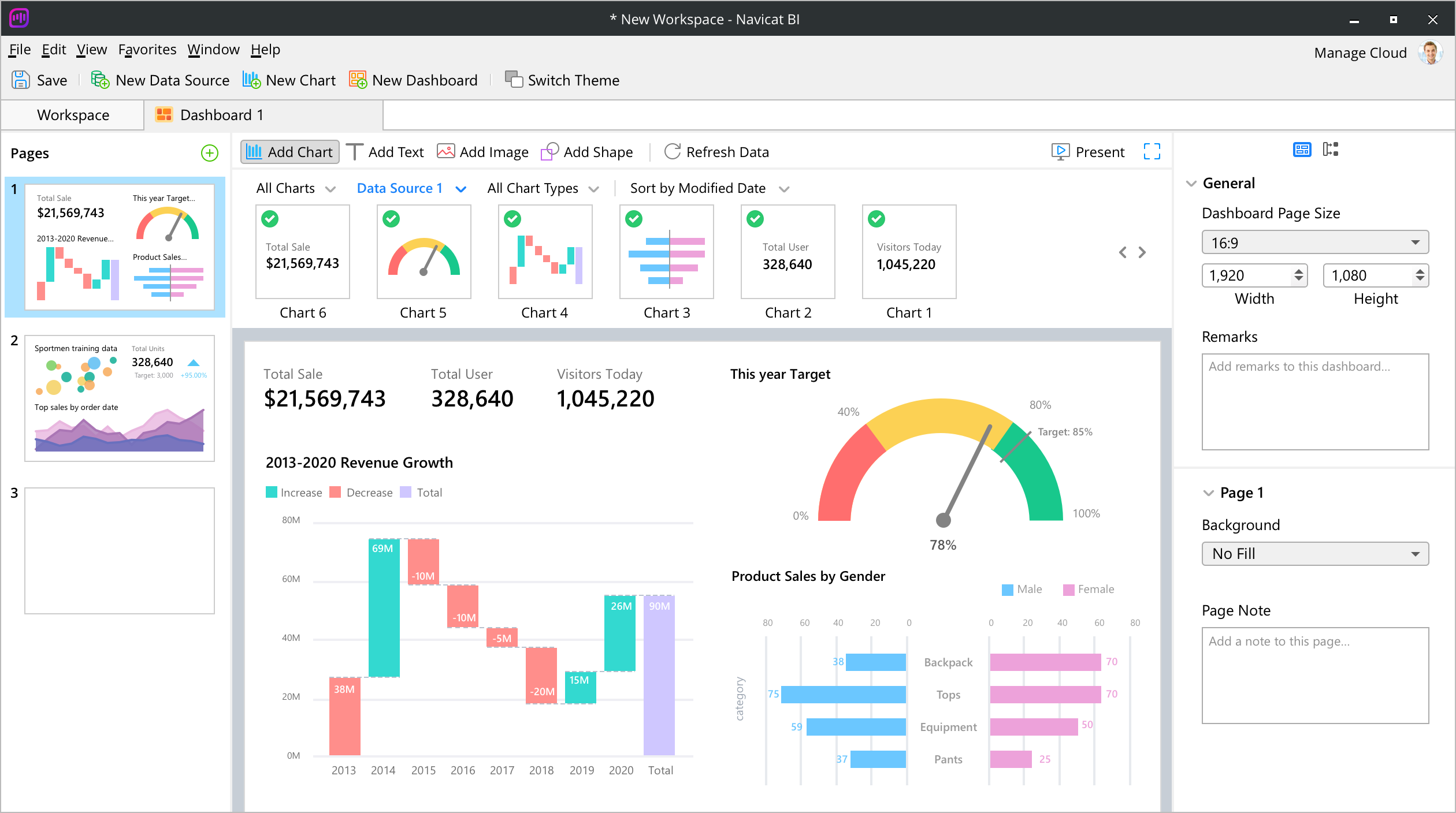
Build an interactive dashboard to display a collection of your charts. Combine multiple views of data to gain a richer insight. You can also create separate dashboards for different topics that you would like to track.
Group Chart
Visualize related information for multiple charts. Show how related charts can be synchronized. Just simply hover over one chart to see the effect in the other charts.
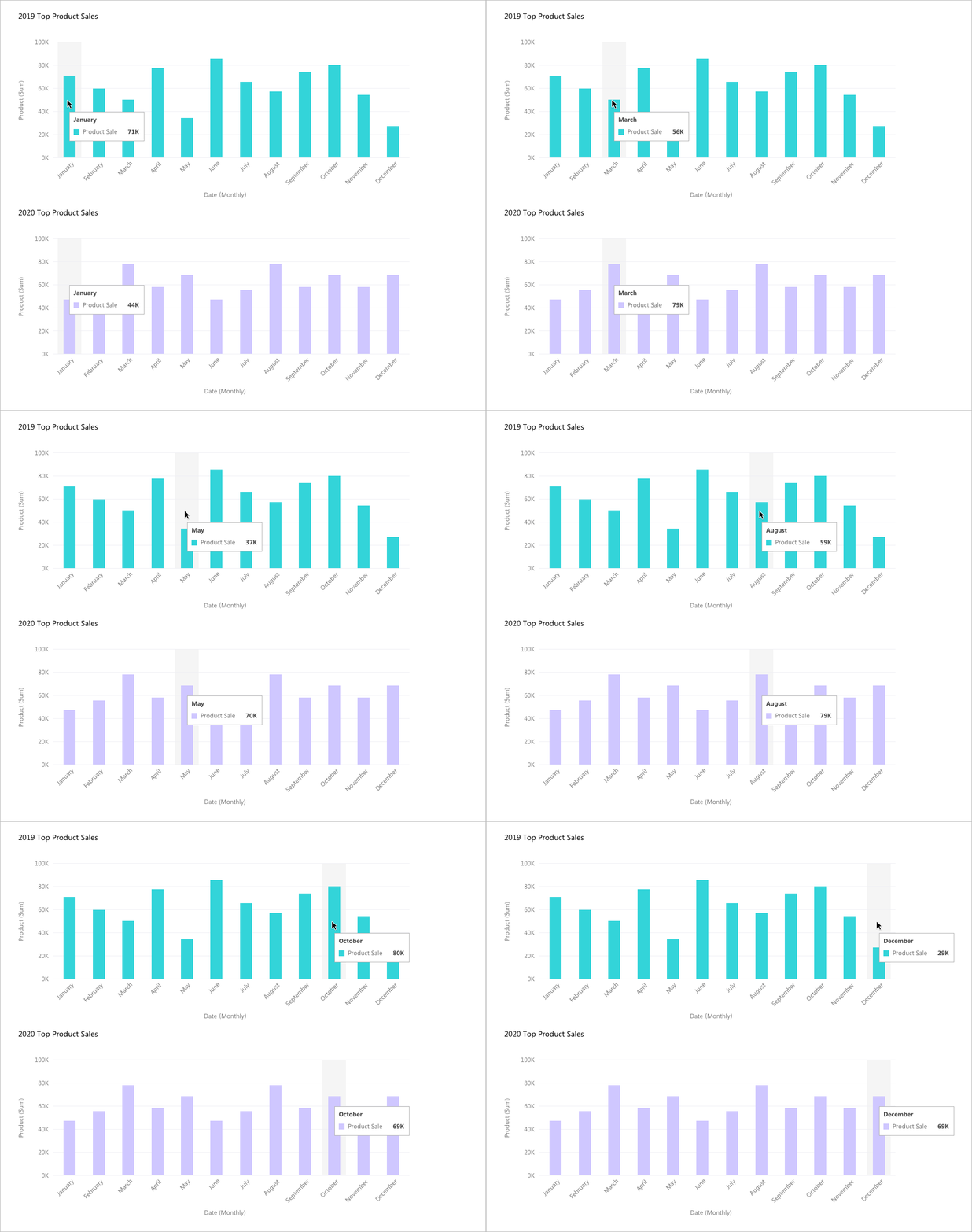
Chart Interaction
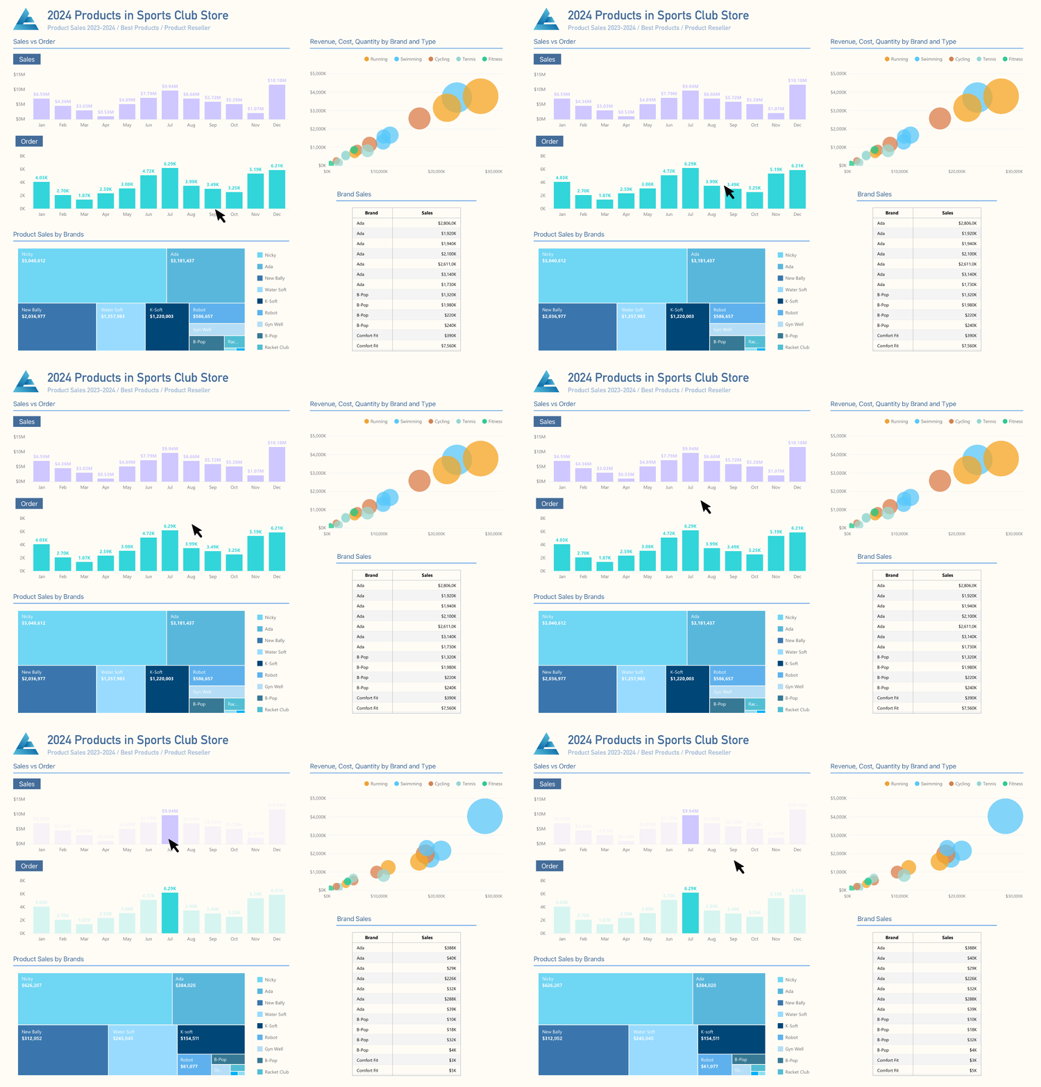
Interconnect all charts on a dashboard that share the same data source. When you select a data point on one of the charts, all the other charts on the same dashboard page linked to the same data source will instantly update to reflect your selection.
Control Chart
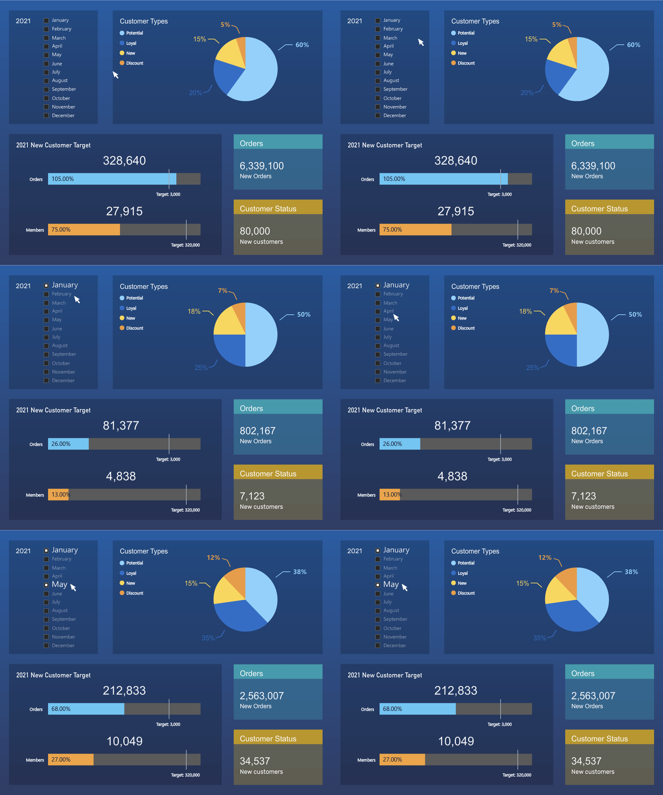
Fine-tune your chart. Filter the data series in all charts in the dashboard within the same data source.
Fully integrated with Navicat Collaboration.
Synchronize your BI workspaces to our cloud solutions and invite your teammates to the project, where they can create and edit together.
Elevate your clarity with focus mode
Provide a distraction-free environment for you to focus on your charts design. You can maximize the workspace and focus on the specific task without getting sidetracked by extraneous information.

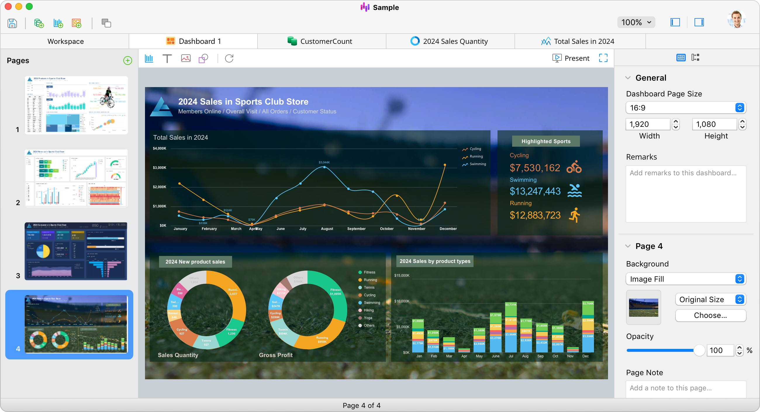
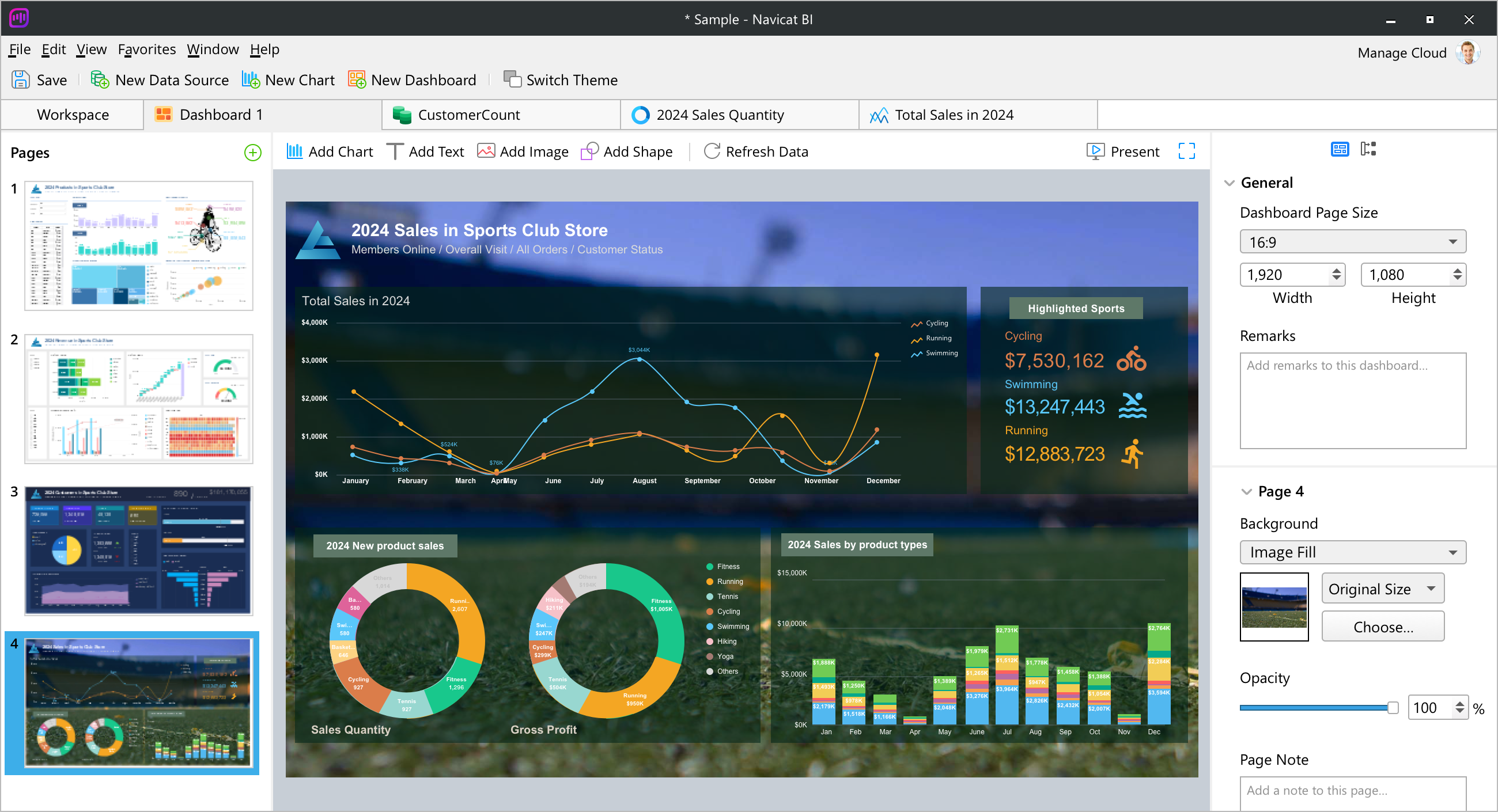
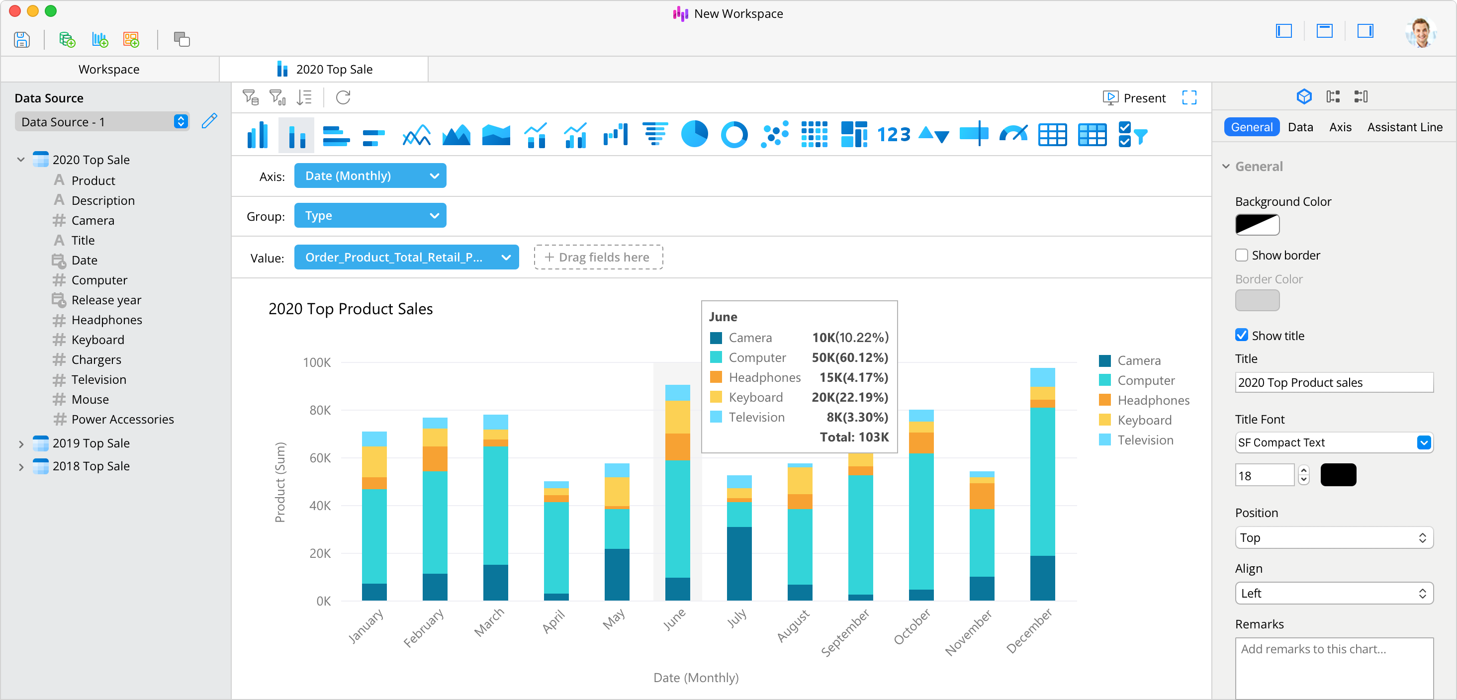
Create Charts Seamlessly with Navicat Native Design.
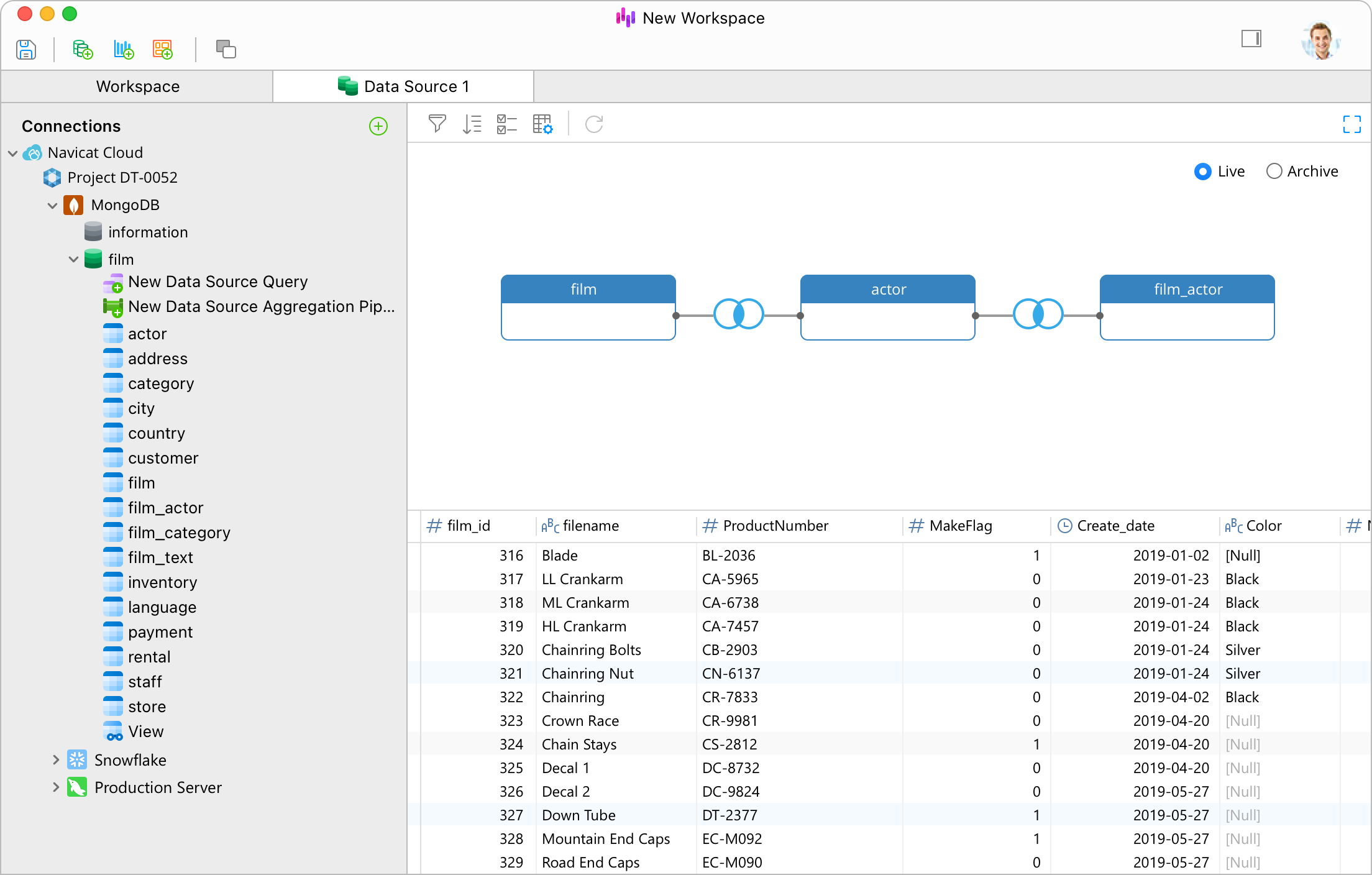
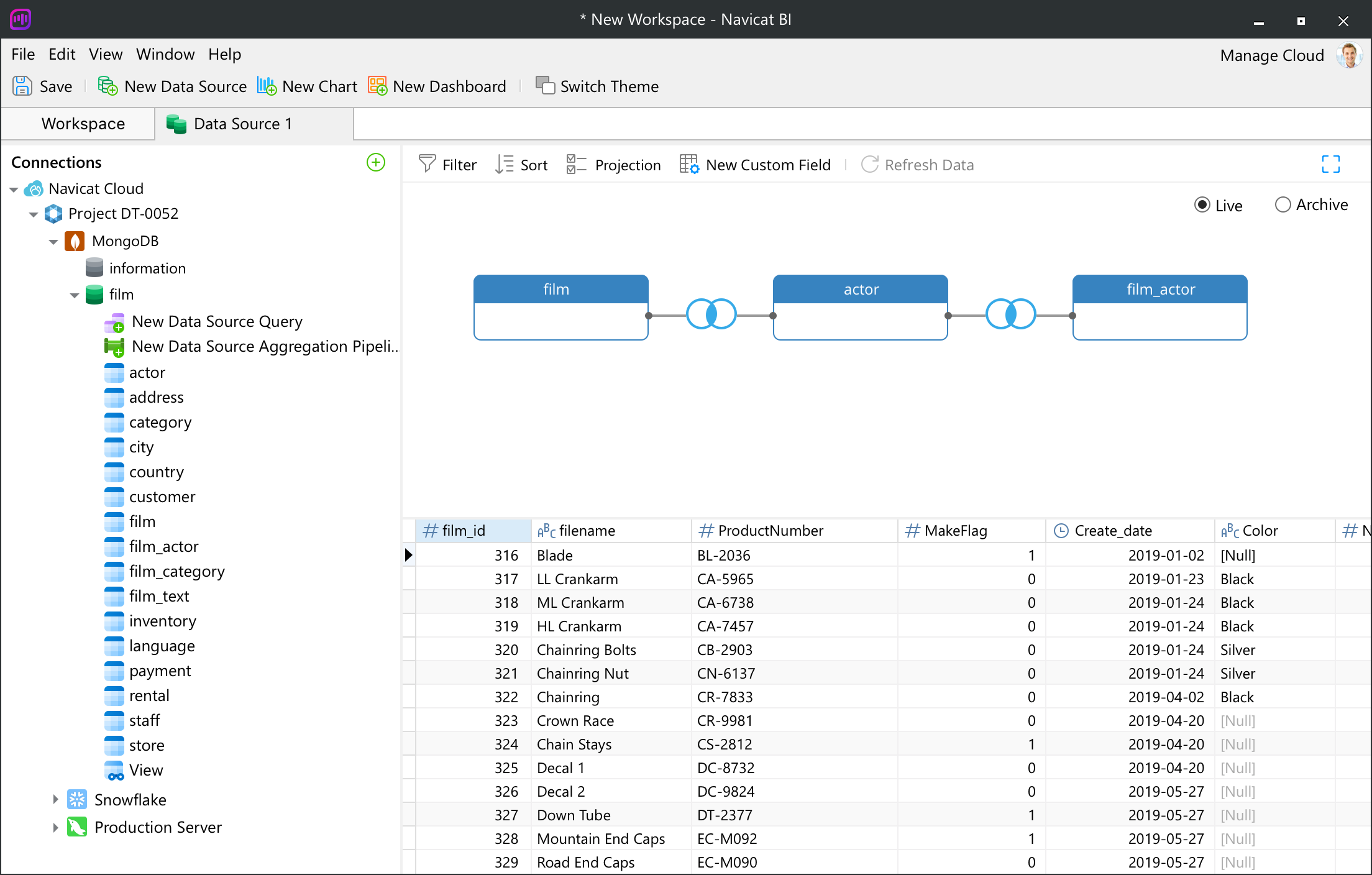
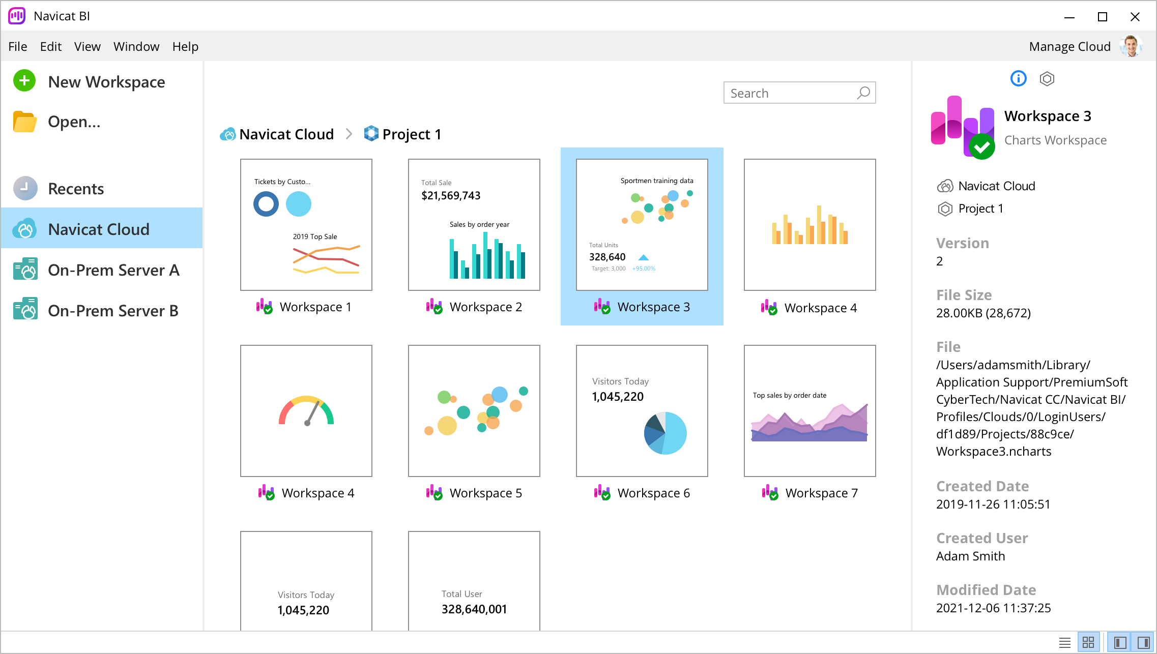
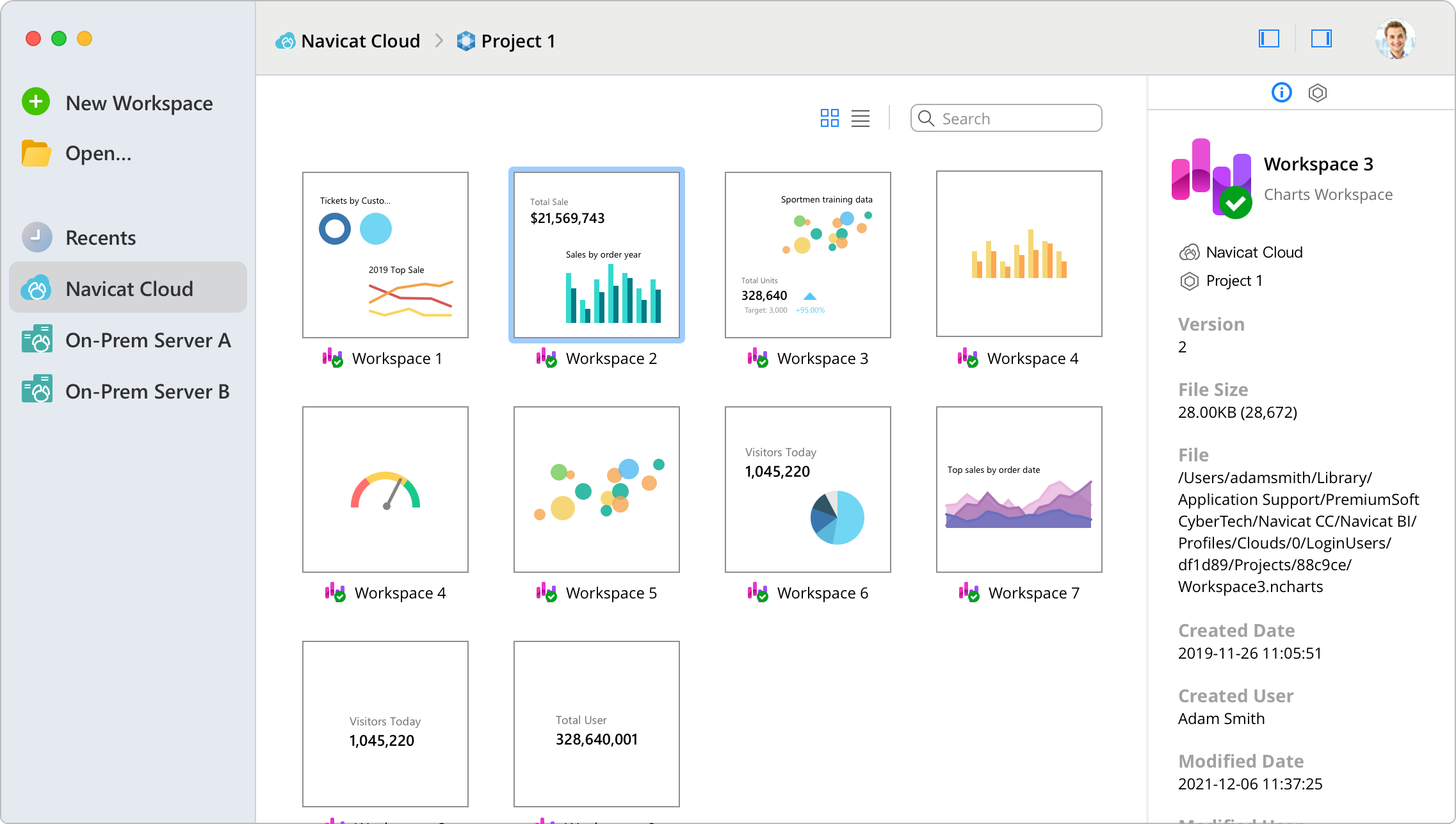
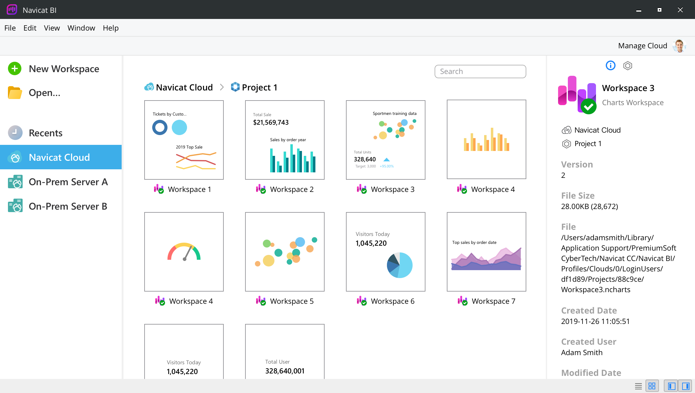
Navicat is natively designed specifically for a particular platform. We give you a more familiar and optimized experience that feels natural for the system you are running. Navicat delivers more stable and enjoyable experiences for your database management.

System Requirements |
|

Windows Microsoft Windows 7, Windows 8, Windows 8.1, Windows 10, Windows 11, Server 2012, Server 2016, Server 2019, Server 2022 |

macOS macOS 11 Big Sur, macOS 12 Monterey, macOS 13 Ventura, macOS 14 Sonoma |

Linux x86_64 aarch64 |
|


